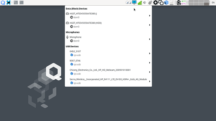
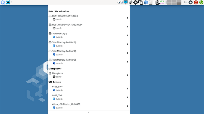
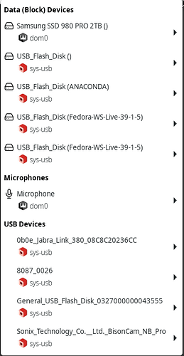
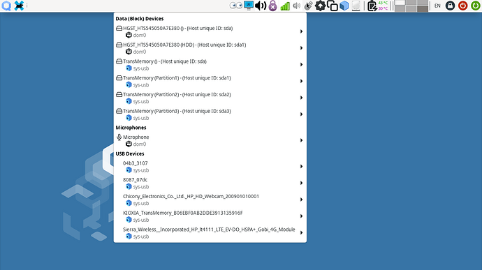
Here is a sneak peek of the new Qubes Devices GUI. The new USB Icon is much better than the old USB+MicroSD (and it is a retro USB-A stick). And looks good on both bright and dark themes. I believe it was merged two days ago.
Looking sharp! One thing that would make it 1 point better (at least for me) would be an option to further separate different types of block devices, eg. physical devices vs mdadm’s vs bcaches vs loopback devices.
![]()
Yes I make spaghetti with my storage
Unfortunately this new UI doesn’t seem to differentiate devices and partitions?
I totally forgot about the old one and hardly recall how it looked like. That drive is a single BTRFS partition with multiple subvolumes.
Yeah, this is a regression I suppose. Someone should fill an issue about that.
Here I re-partitioned a USB stick with 3 individual ext4 partitions and they show up fine. What is the expected behaviour?
I like it!!!
Could this thing possibly take up even more space on the screen?
I agree. There is too much wasted space.
Instead of
Device Icon - Device Name
     Qube Icon - Host qube
Could be:
Device Icon - Device Name ----- Qube Icon - Qube Name
Or something similar
Yes. Agreed. I believe it would better show generic notation of block devices (sdX, sdX1, …). One other feature I would have preferred is the udisksctl power-off action for USB drives. Currently I do it manually from sys-usb
I like the new USB icon. Thank you @alimirjamali for your work!
Just for clarification, it is not my work. I am just reporting developments and changes as they happen in the testing branch ![]()
I am considering mimicking Thorsten Leemhuis’s journalism style but for Qubes. Since I am currently using testing repositories, it could write some newsletter style posts about the major changes to come.
I am sure quite some folks (like me) would love to read through major developments in Qubes! Especially, if they are written by someone with 1’st hand insight.
I had some spare time and decided to have some fun and take a look into the code of Qubes Devices GUI. Even though I am very bad at UI/UX. We are talking about qui subdirectory of qubes-desktop-linux-manager repository.
Changing the tool is of course possible but is an invasive plastic surgery which I won’t recommend in user space. Device Label text is decided within actionable_widgets.py line 393:
self.device_label.set_markup(device.name)
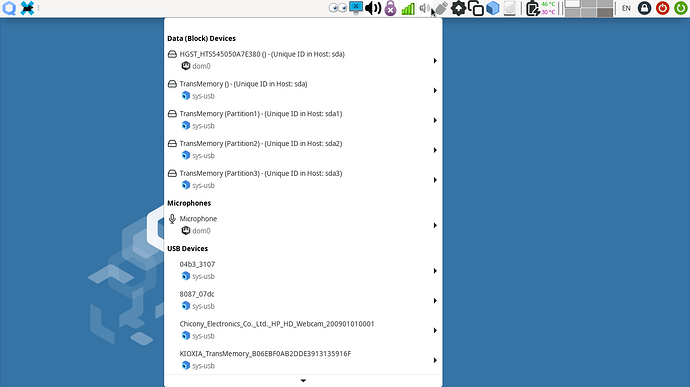
And you can find what else the device provides beside name by looking at backend.py. Specifically the Devices Class and its properties. Extracting unique generic notation of block devices (sdX, sdX1, …) from the host is possible via the id_string property. I have tested it and it works:
I changed that line to:
        if device.device_class == 'block':
            self.device_label.set_markup(device.name + " - (Unique ID in Host: " + device.id_string + ")")
        else:
            self.device_label.set_markup(device.name)
BTW, It might be a good idea to axe the ugly () trailing the block devices without a volume label. It would be necessary to decided if this would be a good idea. And if yes, where it should happen. in qui backend or inside qubesadmin.devices.Deviceinfo upstream library.
P.S.: Interestingly a Harddisk icon is used for block devices and a Microphone Icon for Mics. But nothing for other USB devices. Maybe the developers did not want to include a USB Logo because of licensing complexities. I am not a lawyer and I don’t know.
This has popped up, which basically covers it:
I had some more time to play with the CSS resource files (light, dark). It is pretty easy to shrink the menus to a comfortable size. It is essential on this test laptop which has a 1366x768 display.
p.s.: I will Axe the trailing blank brackets () for myself.
The USB logo could not be inserted in front of USB devices because of licensing complexities which is kinda sad:

Personally, I like that the menu takes up more space. I primarily use a touchpad and sometimes I have problems targeting the cursor precisely. The larger buttons in the new interface make it easier for me to select the entry I want even when my touchpad is acting up. I don’t mind if it’s a configuration option, but I’d like the ability to retain the more spacious menu.
Exactly. It would be very nice if the size could be configurable. The existing code makes it really easy.
Another option would be a larger font, but not spread out over so many lines.
