deeplow
November 13, 2020, 9:44pm
2
Hi @d16-user , welcome to Qubes!
A lot of the things you bring up are being worked on as we speak
Being worked on:
opened 02:03AM - 21 Feb 20 UTC
closed 01:58PM - 07 Feb 23 UTC
T: enhancement
release notes
ux
P: default
C: app menu
## Problem
The app menu today is overwhelming. It needs a lot of work, and once… a design is validated in user testing a custom solution apart from what is possible with XFCE will likely need to be created. Many issues have been filed addressing usability issues around the App menu, and this issue was created to track the design exercise and delivery of assets for creating what is decided upon.
**2021 EDIT:** A Design Brief to guide this project towards completion, was created as both a [_public GDoc_](https://docs.google.com/document/d/14KNDsXVy_SGmWjNREIuJFs-9WKgX31y_0ODtexaR7Yw/edit?usp=sharing) and an _[Etherpad](https://pad.riseup.net/p/2YyPPXqakSYIQMjc6jC8-keep)_.
## Solution
**2021 EDIT:** A modest grant was awarded to the Qubes OS project, to fund:
1. User research and design, for a custom appmenu to better serve Qubes OS users, and
2. A modest/bare-bones implementation.
As such, the #6665 issue has been created to track the first "bare-bones" development of a Qubes custom app menu (nicknamed "Valentina"), that resulted from the funded preliminary design and research. The issue for Valentina is being pointed to as a 'parent' issue to multiple descendant child issues. Descendant child issues, exist to track features that users responded to favorably in preliminary user research—and that we hope to receive community support to implement.
For this issue's initial filing, the below was attached as a proof-of-concept mockup.

## Related Issues
#5386, #5676, #5520
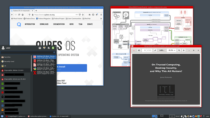
While that’s not done you can replace it right now with whisker menu (which looks nicer in my opinion and has a search functionality). See a related thread here . It looks like this:
d16-user:
For example I might have particular set of vms that all fall under one project but the way qubes is set up it doesn’t allow me to group these together under a specific folder or grouping. Instead, my one VM from one project could be listed next to another VM from a totally separate project when listed in the start menu which i don’t like because I feel its disorganized. Take for example virtual box although it doesn’t compare to qubes in terms of security secondly only being software not a complete operating system it allowed creating a VM folder which made organization incredibly easy, .
This was also my suggestion , but it seems there is some other ideas on why this is not such a great idea.
I don’t fully understand. Can you explain a bit more or provide a screenshot of that functionality in Mate?
This may be somehow related.
The VM’s name is already provided like [work] some window title at the top. So I don’t understand what you are referring to.
In general the coloring issue is a hard topic, especially because it touches the liminations of the human cognition. Here are some related discussions that might interest you:
opened 07:02PM - 19 Dec 19 UTC
T: task
ux
P: default
C: research
## Problem
VM ownership is clearly a very important thing in Qubes. 20% of all … humans are estimated to have some degree of color-blindness. Disambiguating between green, red, and blue, is very difficult, for most of that crowd. Likewise, there are currently only 8 colors—and it's a known cognitive limitation that even if more colors existed, the human brain can only track so much.
## Solution
Let's use this Issue to track the task of finding a better solution than color!
For this Task, no code allowed—just explorations of how to do this well via mockups, critique, Invision prototypes, and feesability insights w/ _possible_ code explorations.
## Cross-referenced Issues/Discussions
- https://github.com/QubesOS/qubes-issues/issues/2042
opened 04:13PM - 17 Dec 16 UTC
T: enhancement
help wanted
C: gui-virtualization
ux
accessibility
P: default
#### Qubes OS version: `R3.2`
See the following:
opened 04:34AM - 23 Feb 17 UTC
closed 10:43PM - 08 Jun 21 UTC
T: enhancement
help wanted
R: not applicable
C: other
P: major
ux
The discussion in #2523 revealed that a rather severe UX problem arises when the… user has a large number of VMs. Eight colors isn't enough to sufficiently distinguish them all. However, that discussion also led to the conclusion that simply adding more colors isn't the correct solution, since it's likely to backfire and ultimately harm the user instead. A more creative solution is needed.
1 Like
![]()
