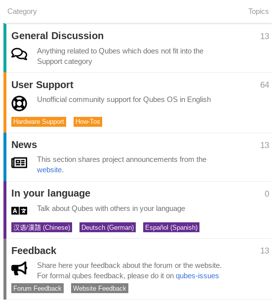
I have played around with category images. Any thoughts on this? @adw @michael @Plexus
1 Like
To make this possible I had to change the css a tiny bit with:
.category-list .category-logo.aspect-image {
    max-width: 32px;
}
.category-heading .category-logo.aspect-image {
    max-width: 32px;
}
To solve this issue: Shrunken Category Images
There is another way of adding category icons, which will add them right before the Category title (instead of bellow), but it is slightly more complex and involves using a theme component (that adds javascript).
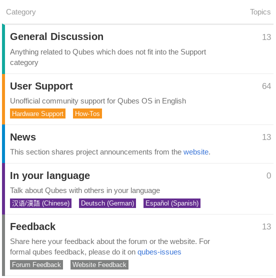
I don’t have a strong opinion on this. I think both ways look fine.
i prefer the icon look. While its more down to individual aesthetics, i find icons visually pleasing more than without.
1 Like
I have no opinion either way. FWIW, I struggle with the same sort of decision with the Qubes website. If anyone finds established best practices for this sort of thing, I’d like to learn more.
1 Like
Prefer no icons. Less clutter. Icons break text alignment. Less is more IMHO.
2 Likes
If they’re FontAwesome icons, you can use fa-fw (fixed width) to address this point.
Yes, they are FontAwesome. Thanks for the tip but I had to them as category images (.png) and not as characters. So it won’t work in this case.
I like them! I think it’s nice to provide visual cues for the different categories.
1 Like
Since it’s been pretty much a week and the majority seems to be favorable (2 for, 2 neutral, 1 against), I have added the icons.
Even though we didn’t find established best-practices, at least now the forum is consistent with the website.